

lauren elis
☆
A graphic designer based in Papillion, Nebraska.
☆
☆

Book Redesign Campaign
All People’s Pantry Concept
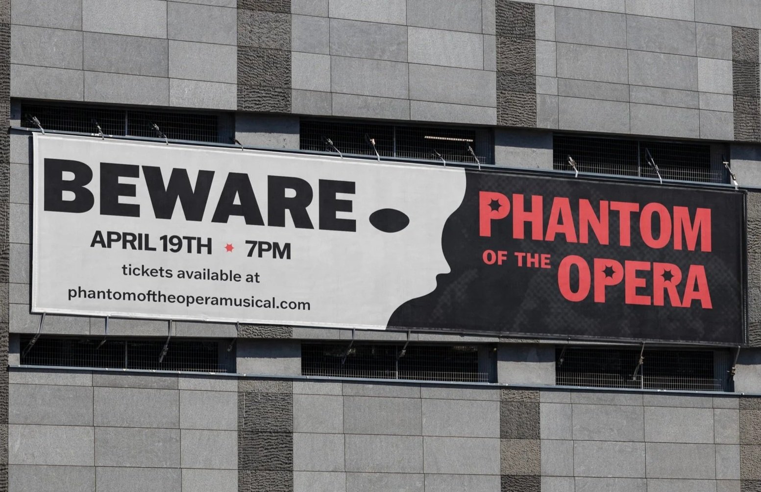
Phantom of the Opera Typography Campaign
This project was one that challenged me when it comes to typography and design. I took a typography class, not knowing much about design, but afterwards it shaped me as a designer. I rebranded the iconic musical The Phantom of the Opera and focused on the rock music that is played throughout the musical. I used varying textures, gradient maps, and bold typography to create the vision I was going for. I feel this project pushed me to become a better designer than when I first started!
This campaign is a passion project I created to showcase my book design skills. I love reading and being creative, so these are my two worlds colliding! My designs are based on different ways I can display typography on a cover as well as enhancing my practice for photo editing and textures.
While in college, I got the chance to work along side the nonprofit, All People’s Pantry. They were looking to revamp their existing brand and find something new. I worked with two other classmates but have put what I contributed. I created the heart hands logo and found the typeface along with the color palette. We wanted the colors to resemble the different foods the nonprofit was providing and that can be found from all over the world. Our goal was to showcase the inclusivity this brand was proud of.
☆
☆
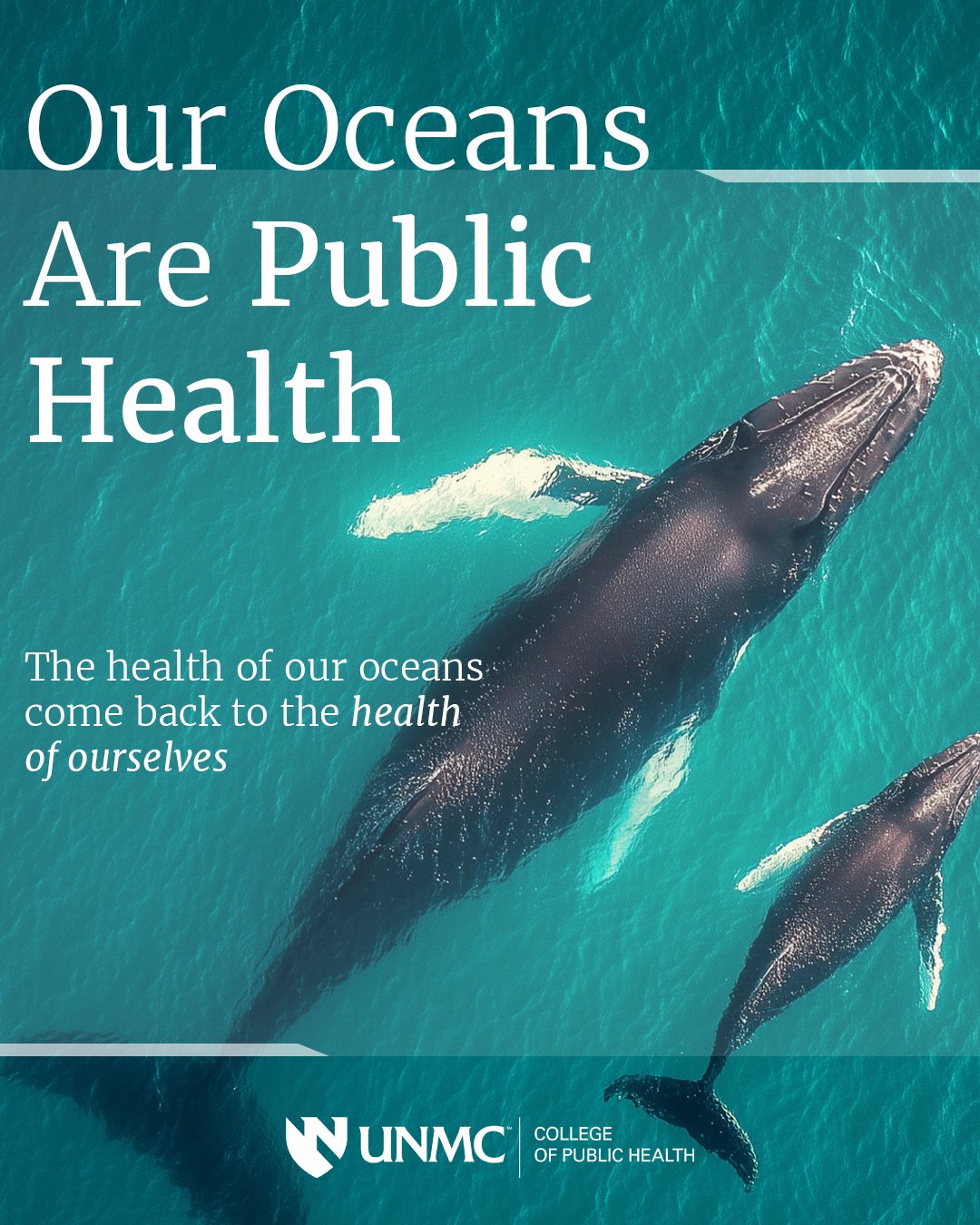
UNMC Marketing and Design Internship 2026
I got the opportunity to work as an intern at the University of Nebraska Medicine for their College of Public Health marketing and design team. I have studied many different assets such as, social media posts, advertising for seminars, and brand specific products for their 20-year anniversary!
Sumter Theatre Rebrand
In college, I rebranded a local amphitheater near me to bring a more electric vibe to their identity. I started with creating the logo combining the “S” in Sumter and sound waves. I made the “S” in a custom font and played around until I got the right effect! After that I found photos and textures that felt high energy and edited them within Illustrator and Photoshop. Along with the photos, I wanted colors that felt electric and resembled the environment that the theatre is located. Sumter Theatre is the perfect place for “golden hour”, so I knew I needed that bright orange color as the primary color.
SuperGoop Rebrand Concept
This project was one of my first rebrand designs where I wanted to practice my ability to distort type and creating a logo. I wanted to create something that focused on their sunscreen collection to bring a more beach aesthetic to their overall brand. The SuperGoop sunscreen is one of their best sellers, so I focused on rebranding their packaging as well as social media designs.